
InnoSpace
All in one entertainment service for 2030
〰️
All in one entertainment service for 2030 〰️


Overview
Roles
UX Designer UX Researcher
Research
Time taken
4 months
Problem Statement
In 2030, remote workers with children face challenges in efficiently discovering personalized streaming content without wasting time.

Aim
To develop an advanced streaming solution for remote workers with children by 2030, utilizing AI-driven content recommendations and immersive interfaces. The solution will feature child-friendly UI, separate interfaces for kids, and customizable options, enabling seamless access to personalized entertainment while balancing work and family life in the digital age.
User persona
“Hi, My name is Ryan and this is Andy, I have been working remotely for the past five years, enjoying the flexibility it offers. My role as a data analyst demands focused and uninterrupted work hours, but balancing work and family has become more challenging with the inclusion of my son’s learning activities.”


Storyboard


Mid- Fidelity Protoypes

Home page

Account selection

Settings

Account creation

Store page

Preference page
(hover to see protoypes)
After conducting thorough research on design UIs specifically tailored for televisions as my primary interface, I developed mid-fidelity prototypes to refine and test the solution's usability, ensuring an intuitive and user-friendly experience for both remote workers and their children

User testing

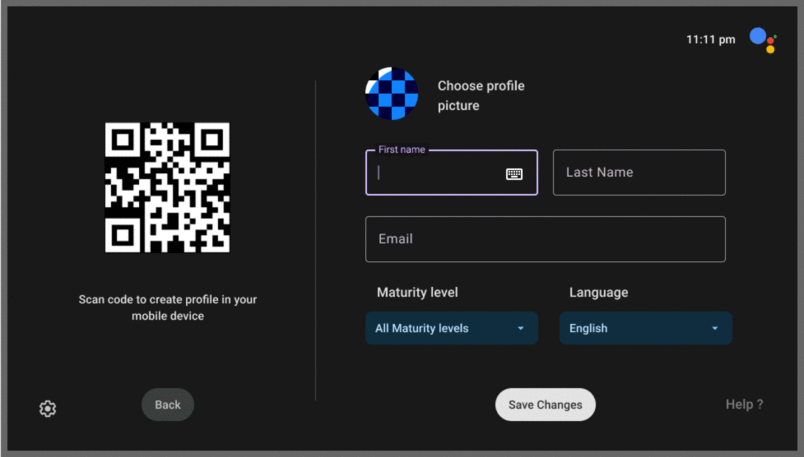


During user testing, several key issues were identified. First, the settings page lacked descriptions, leaving users unsure of the functions available. On the account creation page, the inclusion of a "maturity level" option caused confusion, as users were unclear whether it referred to the user's maturity or the content's maturity level.
Additionally, some back buttons were found to be redundant, leading to a cluttered interface. The preferences page also presented too many options, which was overwhelming and not kid-friendly. A psychologist recommended making the color scheme more appealing to children, while an accessibility designer suggested incorporating gesture controls to allow kids to easily interact with and control the video content.

Hi fi Mockups

Button
Switch
Checkbox
Dropdown
In the development of the high-fidelity mockups, I utilized a blue, colder tone for the adult interface to create a calming and professional atmosphere, while employing bright whites and yellows for the children's interface to make it more engaging and kid-friendly. After extensive user testing, the final video showcases the profile creation process, fully demonstrating the refined high-fidelity color scheme. This included carefully crafted color schemes for buttons and dropdowns, ensuring a visually cohesive and user-friendly experience.
To ensure maximum compatibility and intuitive design, I adopted the Google AndroidTV system style. This choice was based on the widespread familiarity and established user base of the AndroidTV platform, allowing users to navigate the interface easily and comfortably. The combination of tailored color schemes and the well-known AndroidTV design language resulted in a polished and accessible interface that meets the needs of both adults and children.


Hover to see the difference between Regular and Child profile

Rest of my Creative Quests

Solitude

Mowtown Murals

Aqualuxe

InnoVision

The Man cave

Others